Hi there AppWorks fans,
Welcome to a new installment of AppWorks tips.
To make sure your knowledge workers keep focus on the case they’re working on, the last thing you want to enable in your solution is jumping around from one screen to the other and showing an overwhelming flow of information. Key for a steady and easy to use solution is simplicity and elegance.
One of the features of the platform is the usage of tasks (in combination with a lifecycle, activity flow, or BPM). You can show these tasks in a specific ‘Tasks’ panel of a layout for your case instances. These tasks are clickable (to open/view them), but that action moves the knowledge workers to a different screen; This post hacks the panel to avoid moving away from the focusable case you’re working on.
Time for action…
Let’s get right into it…
Boot your VM, log in to the platform with your developer account, and start your favorite workspace with corresponding project. Create a new ‘Case’ entity with a case_name property. Generate the default BBs and add the lifecycle BB as well. My view is like this with my naming convention applied:

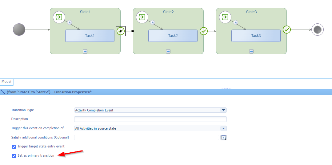
The lifecycle can have a simple implementation like this with the primary transition per flow in place (this transition setting simply makes the lifecycle looks better in the corresponding panel in runtime)
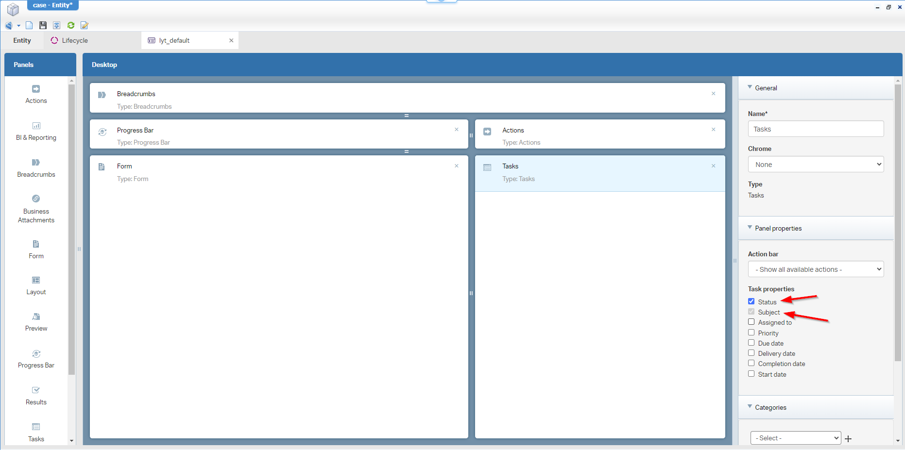
Because of the Lifecycle BB, I update the layout of the case with two extra panels (the ‘Progress Bar’- and ‘Tasks’-panel). In the ‘Tasks’, we only need two field (We’ll get back to this!):
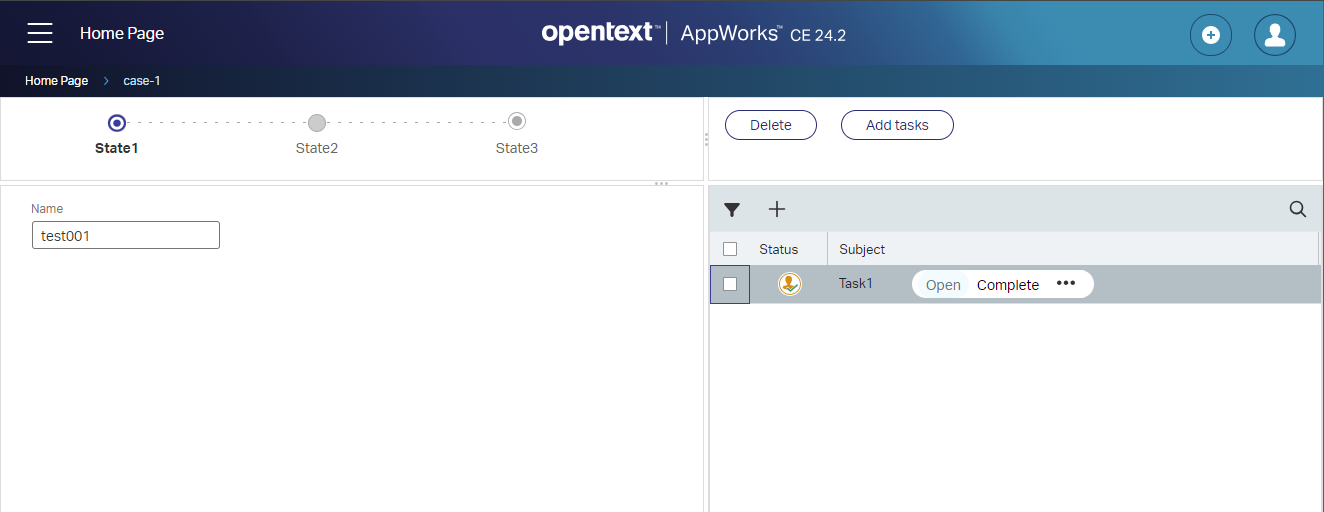
After publication, and creation a first case in runtime, this is my first view:
With this starting point, I want to improve two things for this post.
- Add a “Close case” action button in the top right action bar.
- Making sure, we can’t “Open” the tasks, but only completing it (or any other non-opening action).
The “Close case” action
This is a simple one, as it’s an action type of ‘Rule’ BB on the ‘Case’ entity looking like this:
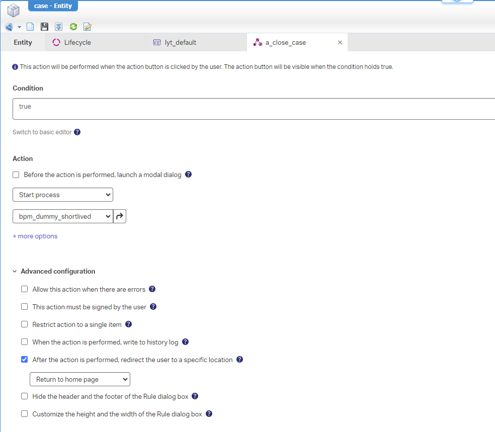
This is the BPM bpm_dummy_shortlived behind it, and we save it in the bpms folder of the project (watch this during your creation and saving actions…It’s a common mistake!)
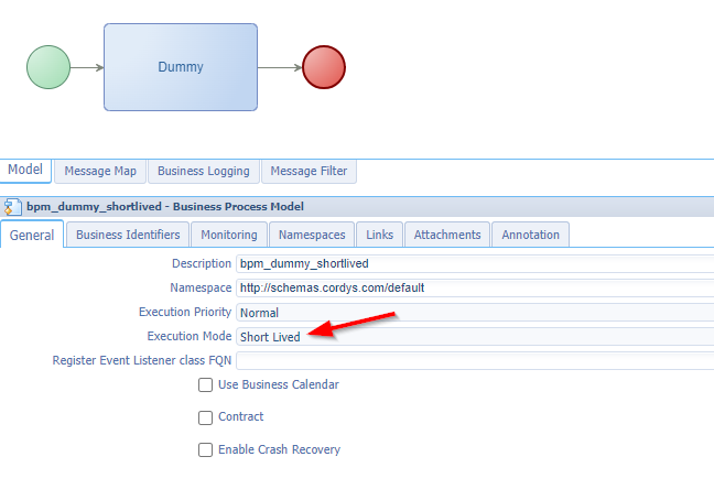
“Short lived” makes it a synchronous call, and an “in memory” execution; With all monitoring disabled it will not show up in the PIM; In this case that’s fine. Double-check the other tabs for yourself on proper configurations.
…
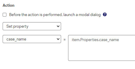
Owhhhh…An extra thing to quote here! Please, stop doing stuff like this…It’s helping nobody and only pollutes your audit information with garbage over time:
…
Once the action is in place, you can even remove the ‘Breadcrumb’ panel from the layout to have a solid starting point when your knowledge workers are ready with the case and closing it up for the day.
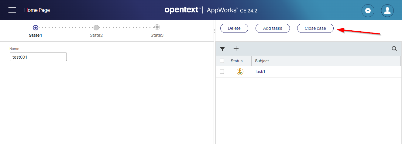
After publication, the action will automagically pop up in the action bar of the case instance:
Next feature…
Avoid opening the task (pre-configuration)
Now we get to the core of the post as we want two things out of our way. That’s this list of actions…
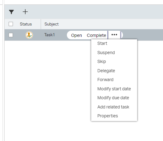
…and not opening the task by clicking on it!
…
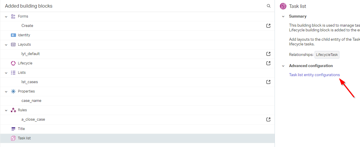
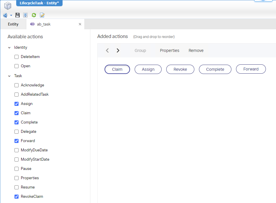
You easily limit the actions by adding a new ‘Action bar’ BB to the (watch carefully!) relative ‘LifecycleTask’ entity of the case…Here:
The actions I apply are:
On the case layout, you can now select this new action bar to the ‘Tasks’ panel:
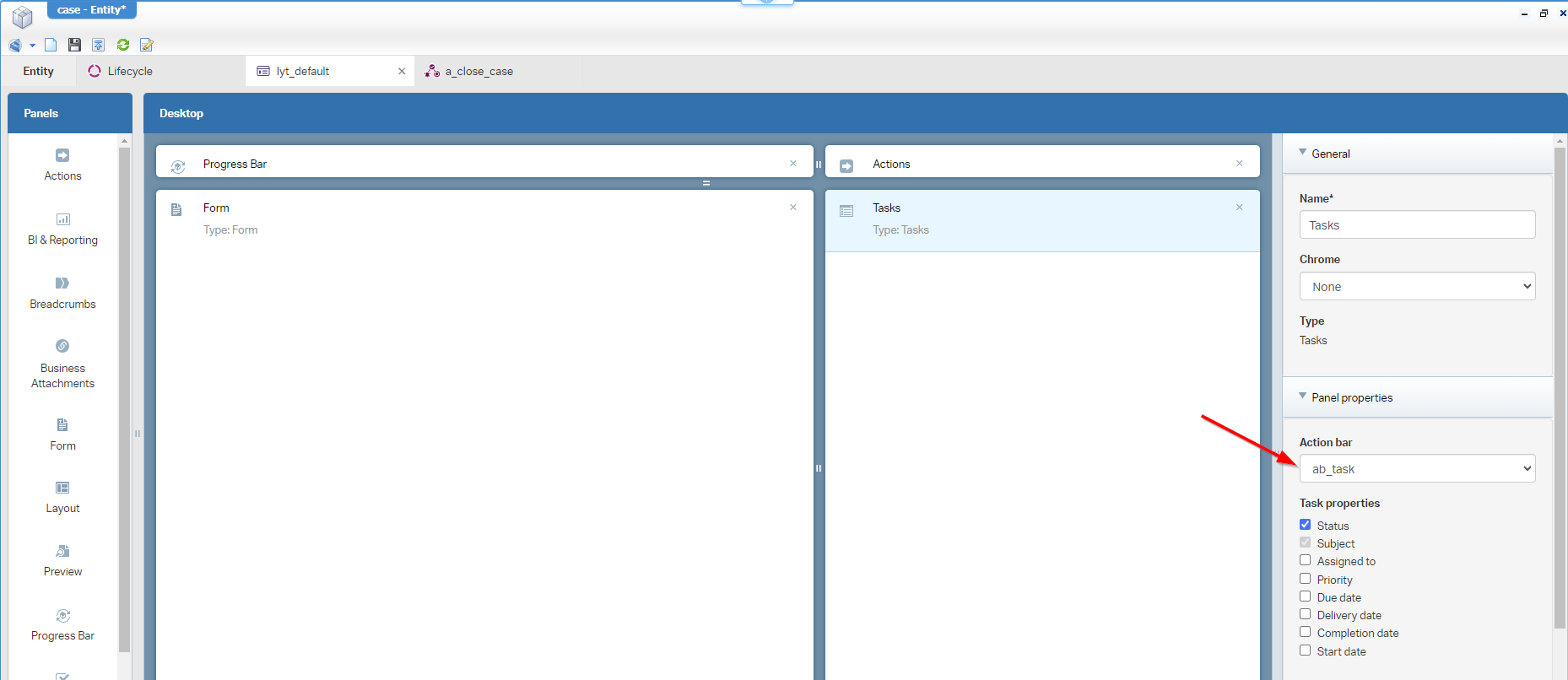
I know, sometimes you glue things together across entities!
After publication, you can now only use the configured actions to manage the task (for me that’s only ‘Complete’ and ‘Forward’, as I did not configure any ‘Claiming’ for our tasks…It’s out of scope for now!):
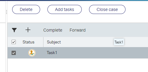
The only “extra” action that we can do is clicking the task itself and still triggering the ‘Open’ action; We’ll fix this in the next part…
Avoid opening the task (the CSS hack)
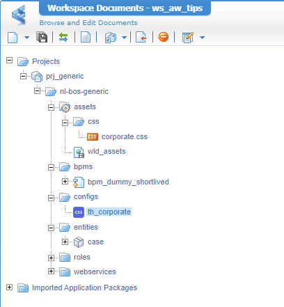
For CSS, I always recommend a loosely coupled solution as explained in this post via a ‘Web library definition’ document and @import... in the ‘Theme’ type of document for the advanced tab…Have a read in that post on this result:
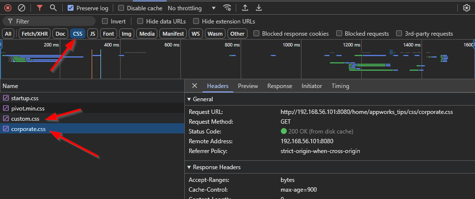
In runtime, you’ll see a result like this passing by in the developer tools <F12> of Chrome:
Now we’re ready to continue the CSS hacks to avoid the “open” click event on the task. For this we dive again in the developer tools with a selection of our task and add a first styling in “inspector mode”:

See that the task is now unclickable…it’s magic! 🪄⋆。 °✩
What we do miss now is the click-ability of the checkmark!? Well, select it again and add some more inspector CSS:
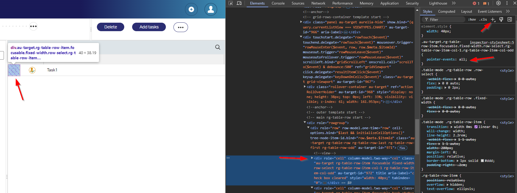
Works nice…correct? Well, with these 2 CSS selectors, we can now update our corporate.css with those entries:
1 | .au-target.rg-table-row.rg-table-row-last.rg-table-row-first.rg-table-row-odd { |
FYI: With CSS, JavaScript, or any other web related content, I always recommend using an incognito tab of the browser which decreases caching issues during development of these files!
Publish the CSS and your first hack is usable. But if you look closely, there is more! Complete the first task which gives you the second task and try again….hmmmm, it’s all selectable again; Time for an update with two extra lines:
1 | .au-target.rg-table-row.rg-table-row-first.rg-table-row-odd { |
Complete the task and go to the next one…Again, some CSS additions:
1 | .au-target.rg-table-row.rg-table-row-even { |
Now that we have six lines of CSS selectors, we can make them more condense and readable like this:
1 | .au-target.rg-table-row-item.focusable.fixed-width.row-select.rg-table-row-item-col-1.rg-table-row-item-col-odd { |
For my post and UI, it’s sufficient now; Could be you get a different outcome…Depends on where you use the logic and the version of the platform (I guess!?). You now at least see how you can accomplish such a task on your own.
Download my project here to have a recap or try-out.
Finally, a focusable “DONE” where your knowledge workers can now do what they’re good at; That’s managing a case without distractions and jumping from page to page. Keep UI simple and logic to work with, although we understand the platform works sometimes against it. It is what it is; It’s for us low-code developers important to find workarounds that help the solution, the customer, and the end-users. Have a great weekend; CU next week in another great AppWorks Tips topic.
Don’t forget to subscribe to get updates on the activities happening on this site. Have you noticed the quiz where you find out if you are also “The AppWorks guy”?


