Hi there AppWorks fans,
Welcome to a new installment of AppWorks tips.
And this time something easy as the last post was a bit of a struggle. Applying your company brand to the solution will not be that hard…or is it?…We’ll see!
Let’s get right into it…
Spin it all up and login to your favorite workspace with your favorite (developer rolled) user.
Right click your project and create a new (other) document and go for a new ‘Theme’ document.

And this is what we get…

First for the header image…For this we use a nice transparent .PNG logo file with a proper size of 445px in width and 31px in height (it’s the recommended size from the manual!)
Just hit that ‘Preview’ button for an URL that ends with an interesting preview parameter /home/appworks_tips/app/start/web/?preview=true
I played a bit with the <F5> key, but again and again the preview of the new logo was restored to the original logo. So, it looks like a one-time action…Nice, but I was hoping to keep the screen open next to the ‘Theme’ creation for quick preview.
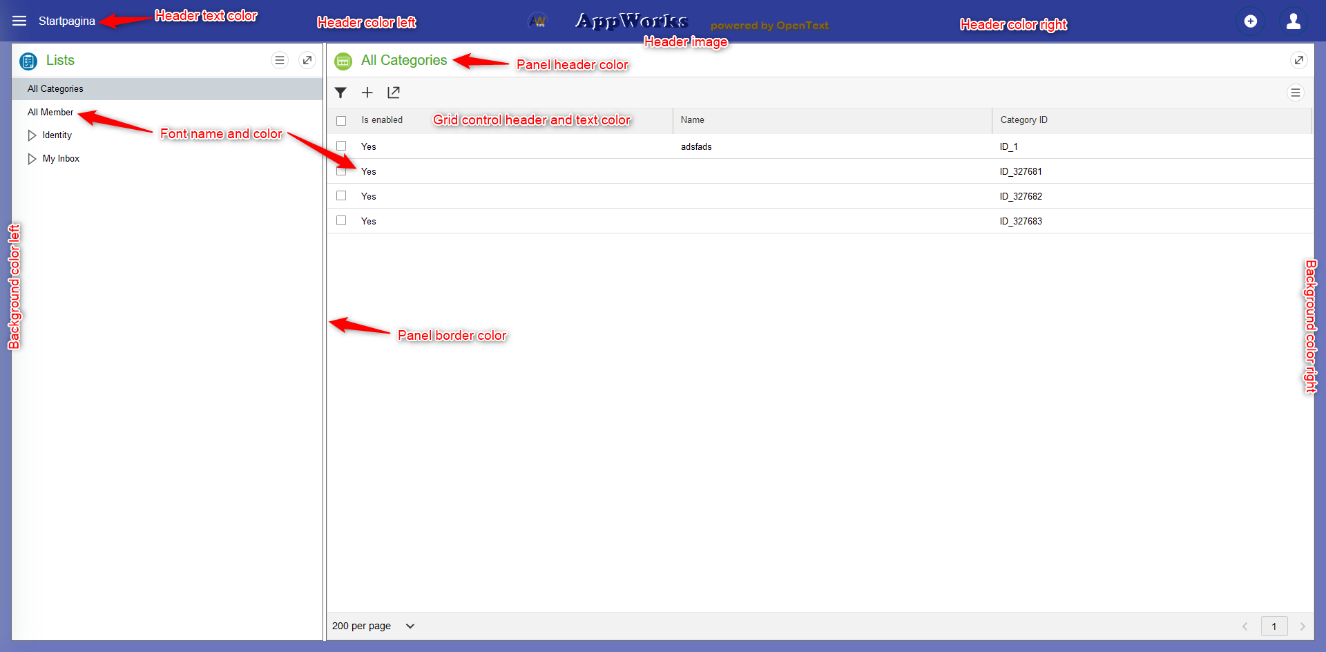
Next to the header image we can select the header background color (and that is only the header!). Most of the time you want to have a same color gradient for the background section itself.
The header text color depends a bit on what you have as a background. With a light background choose a dark text and vice versa. Probably white/black for readability.
The same for the Font section. Don’t choose the ‘Comic Sans’, but one of the other!
Then we have the panel settings. First the header text color and the border lines for the panels. Keep it clean and consistent in your coloring!
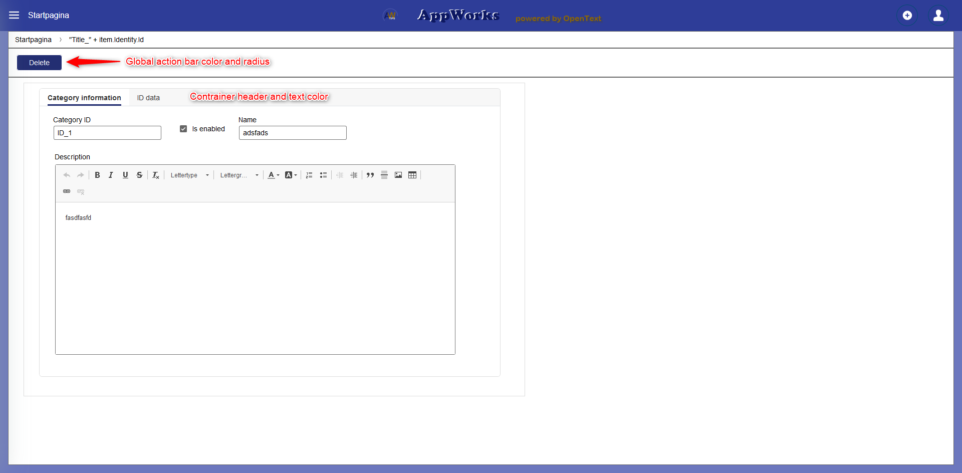
Next the ‘Global action bar’ where buttons are defined.
- Radius is how ‘round’ they should look & feel
- The text color and the background color should be opposite to each other in light/dark
The Container controller text and header are the containers you use on a form
The Grid controller text and header are the result list you use in the solution.
The last 2 I would keep it clean, but it’s a choose you need to make.
After some playing around you might see something like this:
And a second image for the action bar and container (as we need a form and an action bar!)
Save the theme and publish it, so you can check out the real end-result.
A look in the development console
And in the elements tab we see a custom.css file passing by for our custom theme when we select the header image.

With also a 200 GET request in the network tab

The default non-styled solution will only have a startup.css, but what we then see is a 404 GET request on a custom.css file…Not very nice!?

The advance stuff…
Time to make the next step where we click on the ‘Advanced’ tab of the ‘Theme’ document.
You will see something like this:

What are we looking at in this screen? Do we edit that ‘custom.css’ file on the file store?
Yes and no!
The file shows us a pre-processed CSS file in a language called Less
Learn Less here
How does it work…just try it out!
Let’s start by updating the font color @fontColor: #cc0000; and do a save with publish of the ‘Theme’
Now look on the file store sudo cat /opt/opentext/AppWorksPlatform/defaultInst/webroot/organization/appworks_tips/themes/custom.css | grep -B 1 -A 1 cc0000; and notice the changes!
Great…
Now for a finer Font…@fontFamily: 'Verdana';…nice!
Now for @fontFamily: 'Roboto';…It’s not found, and the default browser font will be used!
Let’s make this last font work properly like this:
1 | @import url('https://fonts.googleapis.com/css?family=Roboto&display=swap'); |
Ok…next step…
Grab a font from the ‘interwebs’ like this location
You need to remember this name from the properties of the file (in Windows)

Now create a ‘font’ folder in the ‘assets’ folder and upload the font file.
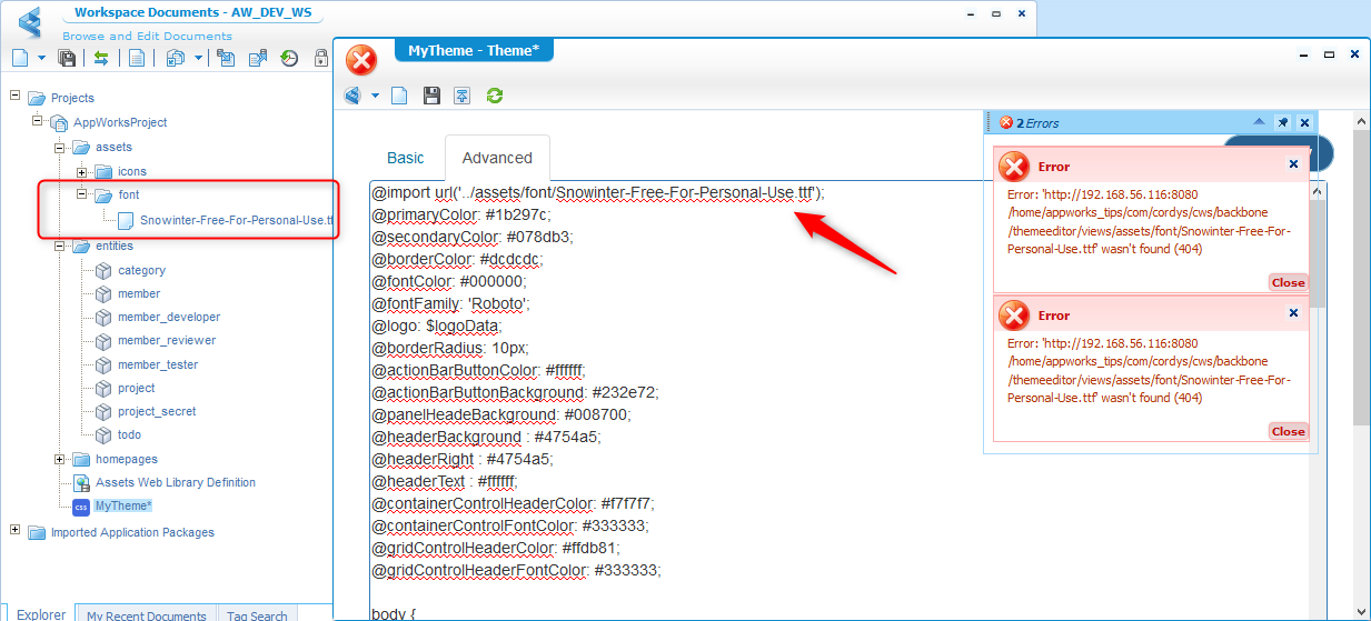
But it failed after save and brings us to an interesting location on the VM /opt/opentext/AppWorksPlatform/defaultInst/webroot/shared/com/cordys/cws/backbone/themeeditor
Different approach as the custom.css is also accessible from this URL http://192.168.56.107:8080/home/appworks_tips/themes/custom.css
So, the font must also be accessible from this URL http://192.168.56.107:8080/home/appworks_tips/assets/font/Snowinter-Free-For-Personal-Use.ttf
And it is….great!
Let’s add an update like this in the top of the advanced panel
1 | @font-face { |
Let’s get ready for ‘Winter’… 👍

The same trick can also be done for the @logo. Upload the header.png to the assets folder, publish it and point to it like this:
@logo: 'http://192.168.56.107:8080/home/appworks_tips/assets/header.png';
Ok…What else?
With CSS we can manipulate all kind of elements. Look into the low-code guide documentation where you can read about ‘Device Specific’ styles and the relevant ‘Selectors’. Some examples are:
.desktop .results-grid .rg-table-header.mobile .results-grid .rg-table-header
Let’s add something customs in the end of the ‘Advanced’ tab
1 | .results-grid .rg-table-row { |
Preview the magic…
This is what we see in the documentation, let’s see if we can find this element back in the development console <F12> in our browser.
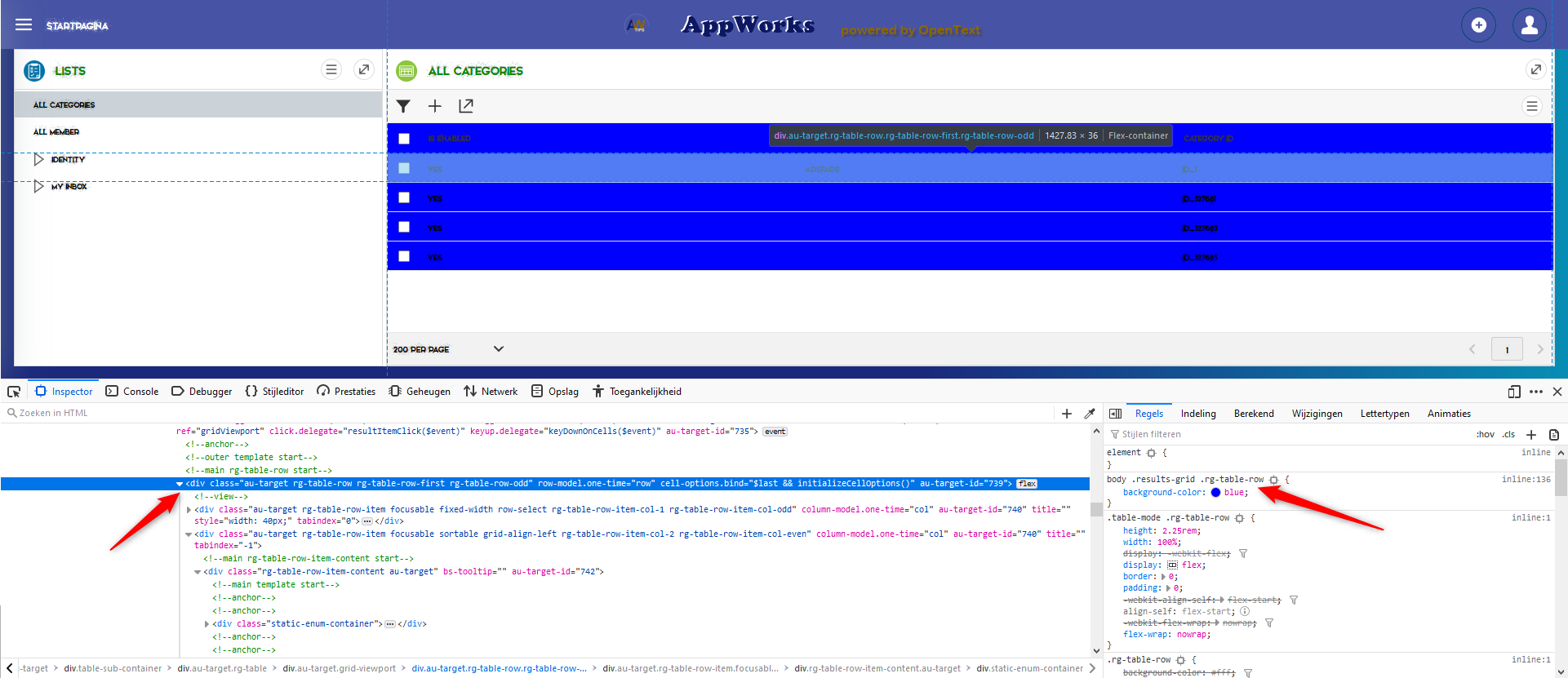
Let’s see if we make that selection box orange!
Add this to our Less data with a preview
1 | .results-grid .rg-table-row .grid-select-column { |

And this can go on and go on…Have fun with making a better style than my screenshots!
Customize login screen?
To make this happen we need to be in this location:
sudo vi /opt/opentext/AppWorksPlatform/defaultInst/webroot/shared/wcp/sso/login.htm
1 | <body> |

Remove your custom theme!
Not as easy as you would expect. Also check the manual, but you delete indeed your theme file and publish your project.
Next to that first step you also need to remove the generated custom.css from the file storage of the appworks platform ‘webroot’ folder.
sudo rm /opt/opentext/AppWorksPlatform/defaultInst/webroot/organization/appworks_tips/themes/custom.css
And after cleaning the browser history and a new browser the old theme was recovered in its glory!
And this makes it a more than ‘easy’ DONE for theming a solution. Looks like you are flexible and accessible in the customization part of the theming…That’s a good thing, but it can also break things so be careful. What we didn’t cover in this post (but it’s on the backlog) is the custom theming for a specific element on a form, but for now I end by sending you out for having a great day and I see you in the next one.
Don’t forget to subscribe to get updates on the activities happening on this site. Have you noticed the quiz where you find out if you are also “The AppWorks guy”?

