
Hi there AppWorks fans,
Welcome to a new installment of AppWorks tips.
In this post we do a deeper dive into the form building block for an entity. We will create new forms and play with all the components that can be used on those forms.
Also, the new ‘Cancellable’ form feature will be explained with an example.
Let’s get right into it…
We split up the form creation process in some smaller sections so we know we will cover it all. There is a lot to discuss on form craftsmanship…
The (classic) ‘Autosave’ form
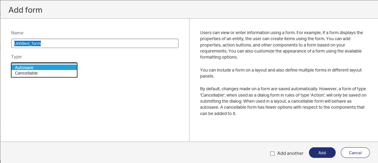
Since AppWorks 16.7 there is a split in form type creation as you will see in the screenshot in the next section. The ‘Autosave’ is the most common one that we normally use to create, view and update entity metadata, but also task related form will make use of these forms. You want to add data into the form and it will automatically save the data when you jump to a next field or continue in your process.
The (new) ‘Cancellable’ form
The other type of form creation is the ‘Cancellable’ form. It is what it says it is…This form can be ‘Cancelled’ by the end-user. So, when a user hits an action button, a ‘Cancellable’ form might be shown (modal popup) where the user can hit the cancel button without any save or hit the explicit save button to trigger a save.
The description tells us there is a difference in components that can be used, so we’ll jump into that in the next section.
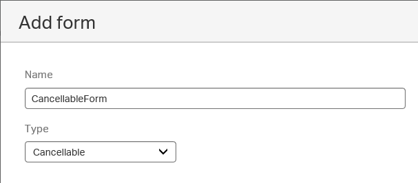
We’ll quickly create one to see what we can do! Open an entity (e.g. ‘Category’) and just create a new form building block with the name ‘CancellableForm’
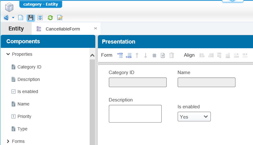
Just create something simple like this
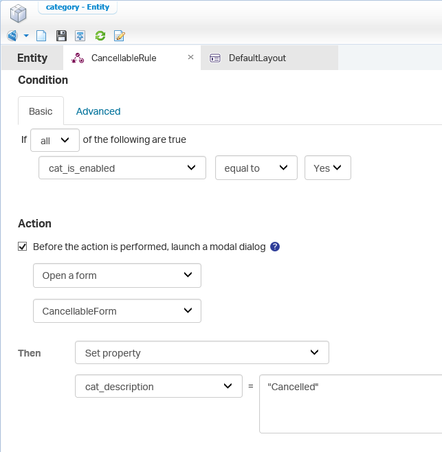
Now we’ll create a new ‘Rule’ building block with the name ‘CancellableRule’ and make sure the type is ‘Action’ as the user needs to be able to hit a button from an action bar later on.
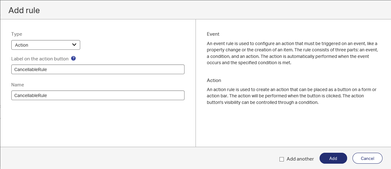
In this new rule we now see an ‘Action’ section with a nice mark ‘Before the action is performed, launch a model dialog’…That is our ‘Cancellable’ form!
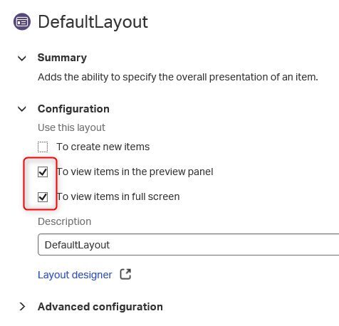
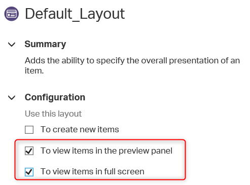
Now we also need to make sure we have a ‘Layout’ building block for our entity available where the action bar is enabled. I already created a ‘DefaultLayout’ for my entity that looks like this
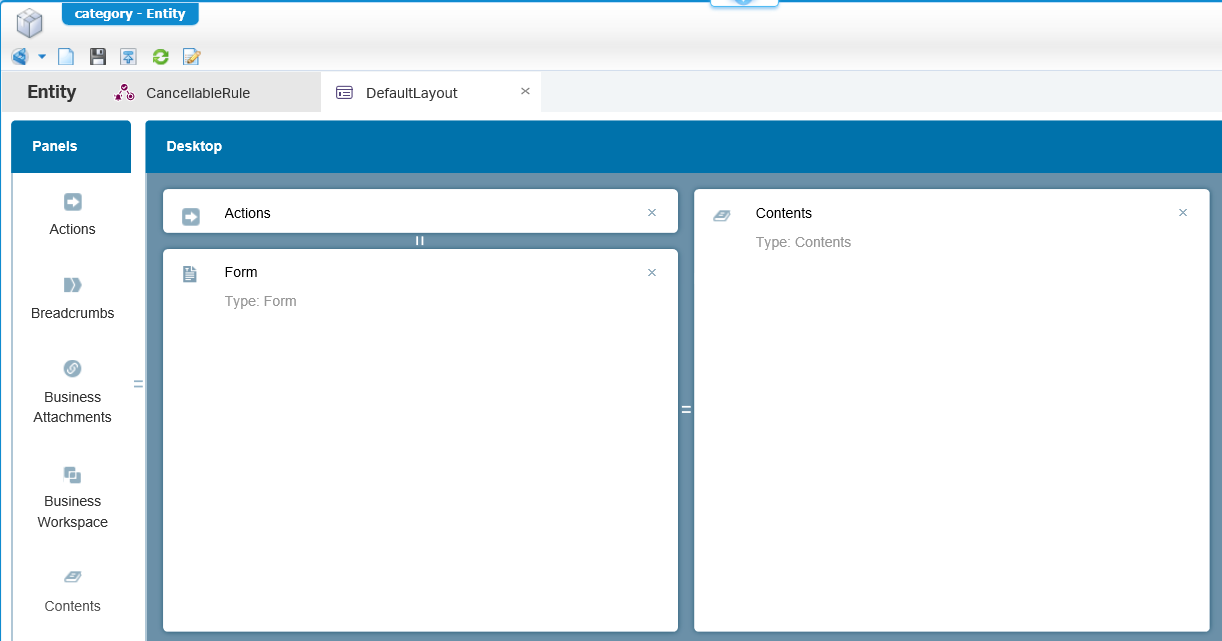
And make sure the layout is used when you view/edit the entity in runtime.
Save the entity, publish it and test it.
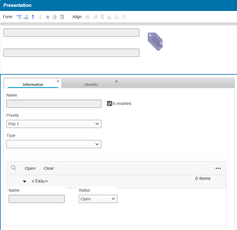
For the test in the front-end create a new entity and directly open it and you see something like this
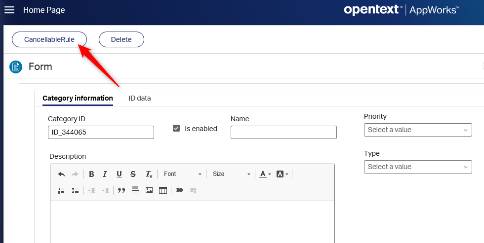
Now first disable the category and wait for the ‘autosave’ action…You see the magic happening from our rule…The ‘CancellableRule’ button should be gone…right!?
Now enable the category again and hit that new ‘CancellableRule’ button.
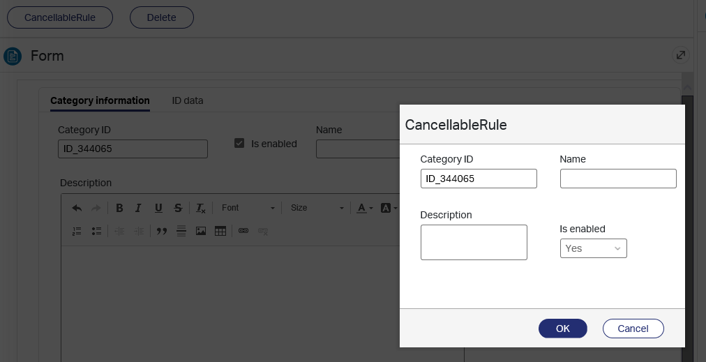
There is our ‘Cancel’ button that brings you back to the original form and when you hit OK our ‘set property’ action from the rule is applied…This sets a property (in our case the ‘description’) to a value of ‘cancellable’.
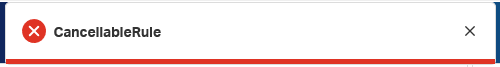
Maybe not a use-case, but in my screenshot we can also update the ‘Is enabled’ field…Yes the one where our rule is applied to…When I disable it and click OK the ‘CancellableRule’ button is gone (which is correct), but the ‘set properties’ action of the rule is not applied (maybe also fine as the rule is not valid any more)…it’s a case we can discuss about!
The big question: What is the difference in components for both type of forms?
It’s the relationship components in the left panel.
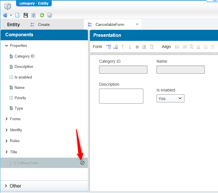
Also check the documentation on this one in the ‘Components that cannot be used in a cancellable form’ section.
The ‘Create’ and ‘Default’ form
Very simple, very easy…
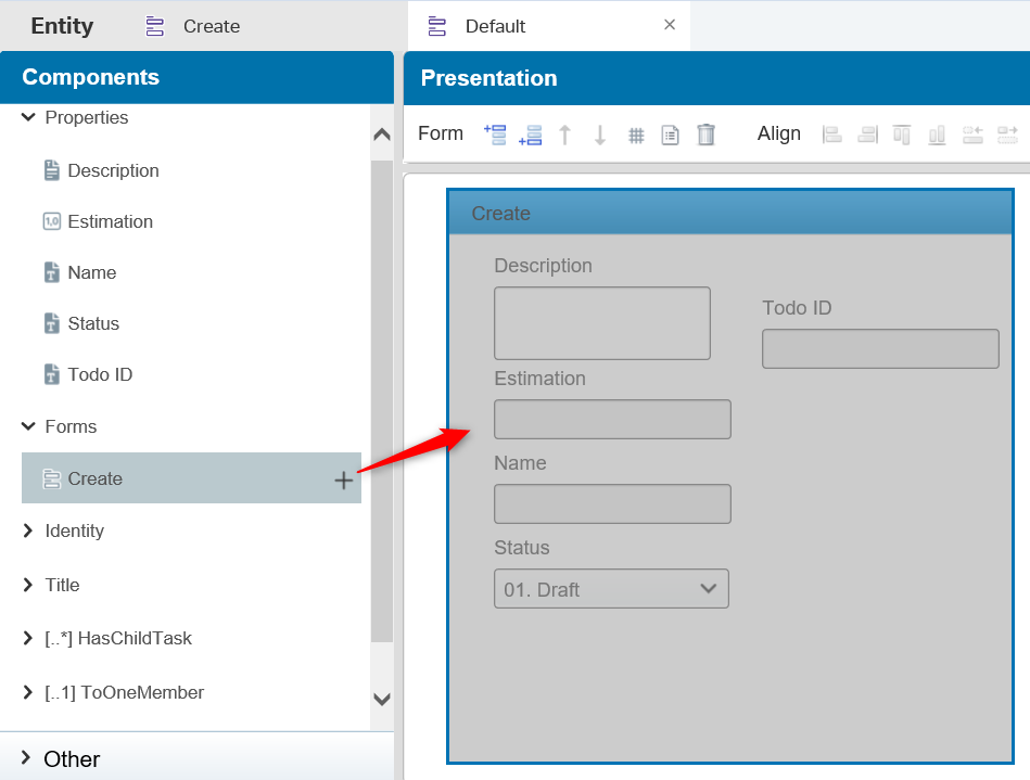
When you create a new autosave form with the name ‘Create’…and keep that capital ‘C’ is place…The form is ‘recognized’ to be used during creating of a new entity.
The ‘Default’ autosave form…with the capital ‘D’…is used for viewing/editing the entity in a later state.
We asked for a feature to make it a selectable option during form creation, but for us low-coders it works for now.
Now for the (autosave) form craftsmanship itself!
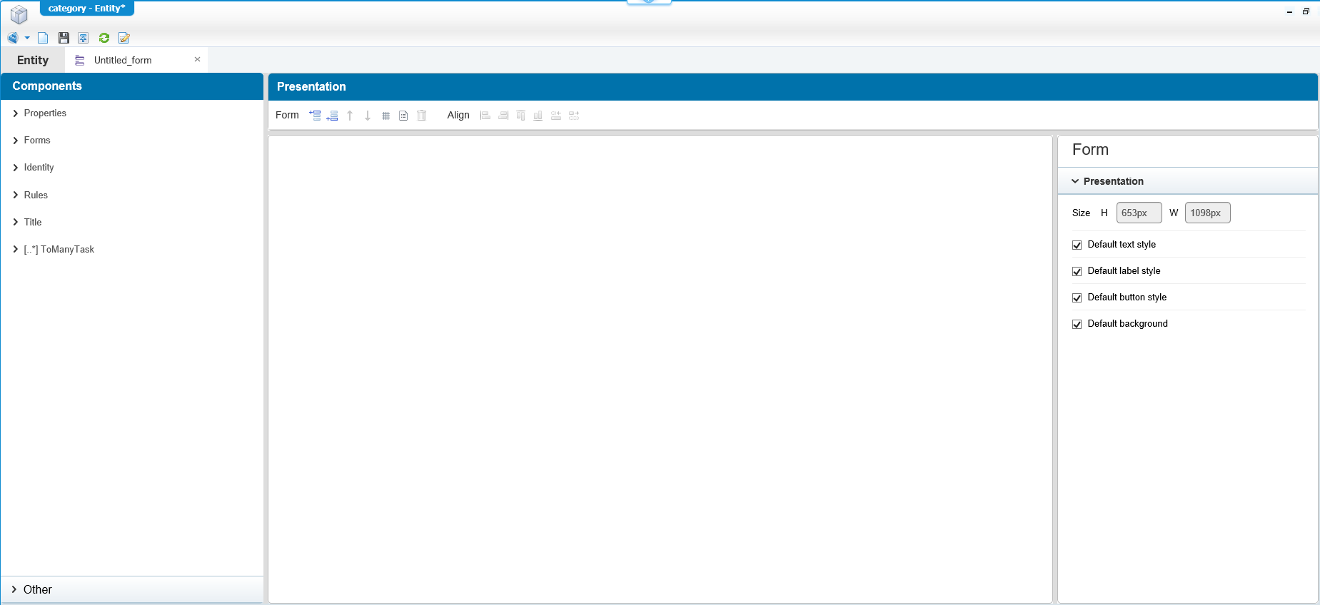
Let’s just create a form and see what we can do in all the panels! Open an existing entity and create a new autosave form where we start with a clean screen
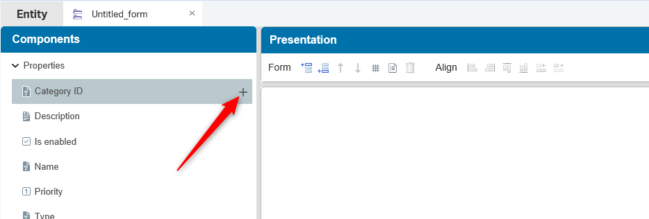
What do we see on the left side of the screen…the ‘Components’? You only see those components for the building blocks you have applied to the entity. All these components can be used on a form with drag & drop functionality or with the plus-sign (where it is placed on the most logic location on the form).
In the bottom of that components panel we see an ‘Other’ collapsed option…why so hidden away and what is behind it?
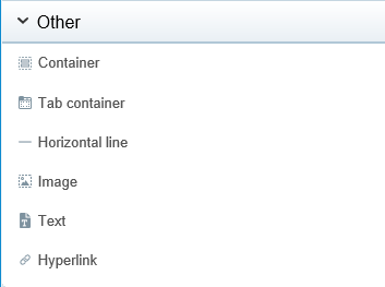
A special section to give our form more ‘balls’.
- Container is a nice component to keep fields together in one box. Also make use of it…In a later stadium you’ll see the value of containers as we can apply rules to it!
- Tab container is the same, but now you hide/categorize information in a tabbed way of working
- Horizontal line to work with sections in your form. Again, for separation of information and to make it all clear
- An image can sometimes tell you more than a thousand words can!
- Information text blocks to clear up things on the form
- Hyperlink to a new location lets you jump to another location; too bad you can’t pass parameters in that URL. We did a request for this on the AppWorks product backlog.
Form presentation and the alignment of components
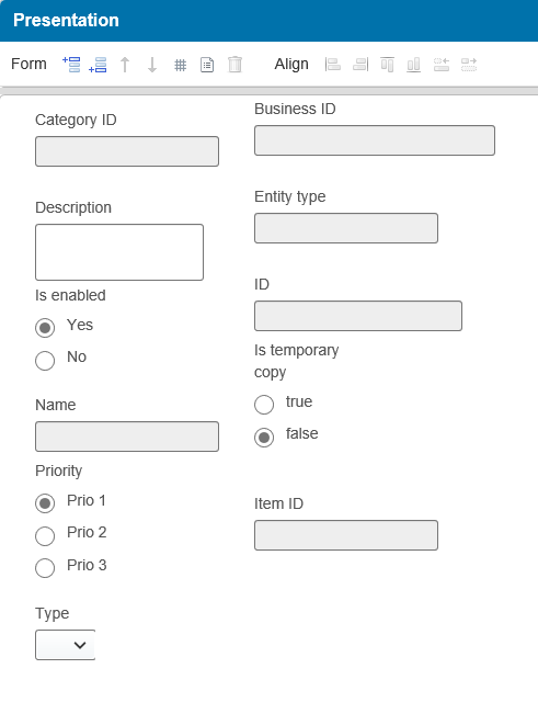
In the middle panel you see your form overview for all components you dragged in, but when you start adding all the components you get with a mess like this
So, first think…what is re-usable and what might be containerized/sectioned?
We saw some components already, but the center panel also had some buttons to layout things much nicer
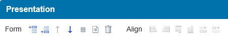
Those ‘Form’-buttons make it easy to section out your form with a ‘header’ and ‘footer’! They can also be removed or moved up and down…You can play with it.
Those ‘Align’-buttons make it easy to make those components look straight in line with the rest. These only apply when you have selected multiple components as they will align on each other depending on the action you use…Also play with this a bit.
Once you’re pro we also have the ‘Short’-cut keys that can be used on a form! Check the documentation in the ‘Keyboard shortcuts for forms’ section, but I really want to create a small table out of it for reference on this page for the keys you would not directly expect!
| Key | Function |
|---|---|
| ↓, ↑, →, ← | Move the selection component for 5px |
↓, ↑, →, ← + <Ctrl> |
Move the selection component for 1px |
↓, ↑, →, ← + <Shift> |
Change the width/height of the selected component by 5px |
↓, ↑, →, ← + <Alt> |
Align (horizontally/vertically) multiple selected components with each other |
| Click + drag | Move a component/container and align its top right corner to 5px |
Click + drag + <Ctrl> |
Move a component/container and align its top right corner to 1px |
The end result after some alignment and playing around could be something like this. But this can even be built better when you add an UI-expert to the team that can create nice UI sketches that can be rebuild in AppWorks as you are totally free on the layout as you might have noticed!
Note from an expert: Make sure you connect the correct skilled people with the power made available to get the most of value out of it!
Components Configuration
Now that we have a nice screen it’s time to take a closer look to the panel on the right side. You probably played with it a little bit, but let’s do a dive on that panel.
What you see in that panel depends on…
what kind of component you have selected
if you selected multiple component (with the
<Shift>key)if it’s a container
if it’s a relationship component
Most of the times you have these setting to make:
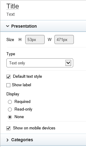
Size is grayed out but can be manipulated in the presentation layer (also with those short-keys!)
Type selection depends on what kind of property is behind it
- Text: Text only, Text Box, multi-line
- Integer, decimal, float: Text only, Text Box, Progress bar
- Boolean: Text only, Check box, Drop list, List box, Radio button
- Currency: Text only, Text Box
- Date: Date, Text only
- Date time: Date time, Text only
- Duration: Duration, Text only
- Image: Image
- Long text: Text only, Text Box, multi-line, Rich text
Questions you might have:
- Difference in ‘Text only’ and ‘Text box’?…You guessed it right!…It’s a box around it. Sometimes a non-boxed field looks nicer in the UI
- Difference in ‘Drop list’ and ‘List box’? In the drop-list you see only 1 value and the other values will drop-down when you click on the box. The list-box always shows all items.
- And yes…If you need to be able to do some rich-text editing with HTML text you are required to use a ‘Long text’ property!
Styling can be applied on the text and on the labels. Here is a screenshot on what can be styled at the moment.
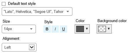
My advice is to be conservative on these styling options as it is better to style on a global level with CSS, but there might be some cases where the default style should change.
- Further below we have the ‘Display’ options…highly underestimated, but most valuable because here you restrict the property on input (required/read only) that you normally would do with business rules or maybe better on the property definition (which is not the case at the moment).
The power of mobile devices
Yeah…now we’re getting somewhere…we’ll place this functionality on the backlog. You get the point probably, but to play with this we are required to add the ‘AppWorks Gateway’ to our platform and we also need the ‘Mobile app’ building block functionality to make it all work…
Great stuff, but not for now…
The power of categories!
Where do we need this for?
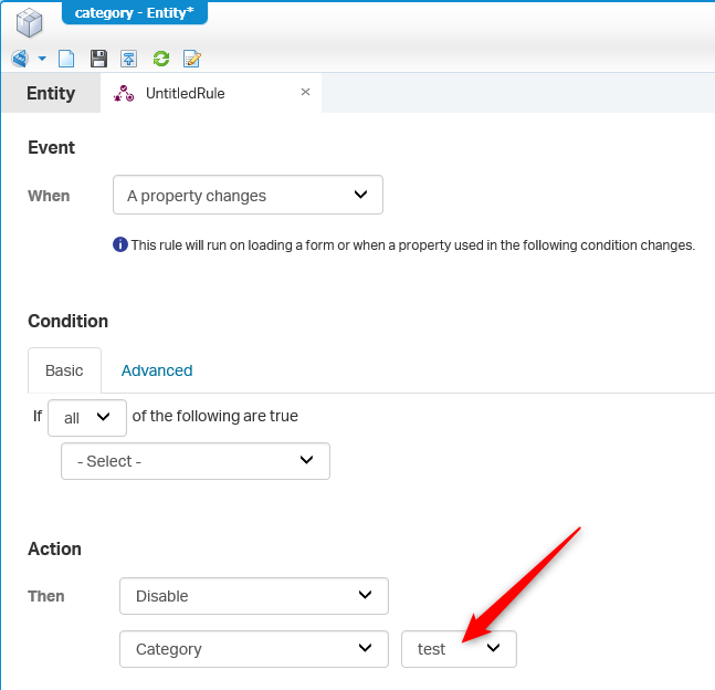
For a single property it might not be that valuable, but when you work with the ‘Container’ component where you add several other components to, you’ll see the power of categories when you also apply rules to it!
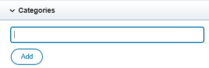
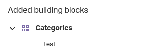
For now, just add a ‘test’ category to your component of choice! Then go back to the entity overview where you will also see the ‘Categories’ building block available
Create a new rule or edit an existing one and check the ‘hide’ and ‘disable’ options on a property change
Adding relations to a form
This is also a ‘thing’ we need to show as magic things can be created when you add those relations to a form.
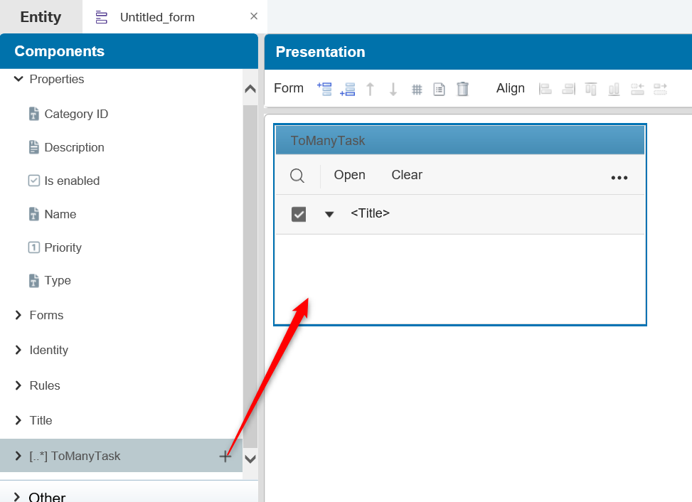
Let’s start with the ‘To Many’ relation and in my case the ‘Category’ to many ‘Task’ relation
After adding the component there are 3 things you need to decide on:
- The type (as it can’t be changed once other properties are placed in it):
- ‘Repeating Group’ is the default where each row is a small form
- ‘Grid’ changes the representation to a table with columns (where you can select the default column for ordering)
- ‘Multiselect’ changes the representation more to a labeling/keywords’ functionality. What you can select is retrieved from the selected list that is available on the related entity. From that selected list you then select to property to show in this view!
- The properties you want to show for each ‘Task’ in that new component
- In my case only ‘Task’ properties can be dragged on the component; these can be seen when you expand the ‘ToManyTask’ component. Drag for example the ‘Task ID’, ‘Name’ and ‘Status’. You can only drag & drop properties on a ‘Repeating Group’ or a ‘Grid’ as the ‘Multiselect’ option retrieves the data from the selected list
- And the list behind the ‘Browse’ button for in this case the ‘Task’ entity. Also, only for the ‘Repeating Group’ and the ‘Grid’ types.
After those 3 decisions you can add extra options
- ‘Show number of items’
- The default ‘row state’ (expanded/collapsed)
- ‘Page size’ for the number of items per page
- Some styling, but you normally would like to do this a global level (as described already)
- And….On a ‘Grid’ you can do some ‘Customize presentation’ magic (it’s another post on the backlog)
- And…On the ‘Repeating Group’ and the ‘Grid’ you can define some actions where the ‘Grid’ has some finetuning with a ‘Filter’ option!
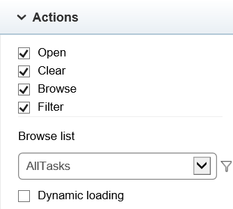
The one and last option is the ‘Dynamic loading’…What will it do?…It’s on option so the list of items is loaded when the user also enters the list. By default, all list information in a form is loaded on form initialization. With a lot of long lists on 1 form this option (per list) gives better performance on the form.
Then we have the ‘To One’ relation and we also jump to the ‘ToDo’ to one ‘Project’ relation for our case.
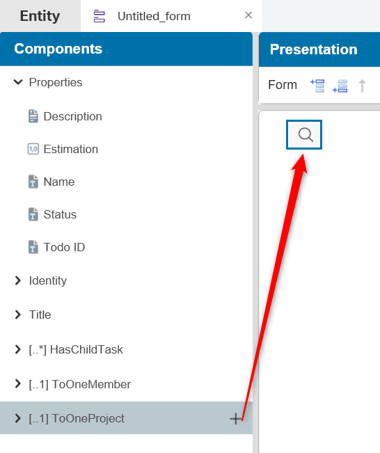
And there you have it…just a ‘Magnifier’. How clean do you want to have it!
Let’s take a watch on the type selection:
- ‘Button(s) only’ shows what it tells. You get extra buttons once you start to add the action for ‘Clear’ and ‘Create’. The magnifier is for the ‘Browse’ action where you can select a related project. Normally you also want to have some properties for the related entity on your form, so you know what is selected.
- ‘Text box’ has the same buttons, but now you directly connect a field from the list to the selection; Again, to show you what you have selected!
- ‘Drop list’ is also the same, but now the selected value is selectable from a list and you see directly what you selected from the list. This type of representation makes it possible to ‘enable autosuggest’ so the end-user can start typing and filter-out the result. Good for the form performance and behaves a bit like the ‘Dynamic loading’ option when you enabled the ‘Browse’ action.
- ‘List box’ will show the result in a list where you can select only one. Normally this kind of representation is to select multiple items, but as this is a ‘toOne’ relation we can only select one item from the list. The disadvantage for this type is also that the whole list is always shown; no filter option are type ahead is possible
- ‘Drop list series’ is a special type and you also can’t jump back to another type once selected! You also need at least 2 properties of the related task on the container. Use the ‘Add’ button, once this type is selected, to add a second (required) property. It’s a nice type of feature to make sure that the first property is always provided with a value selection as at that moment the second property gets enabled for value selection.
More option are available like the styling, ‘show on mobile devices’ and the ‘Categories’, but all are already explained before.
At last we have the ‘Has Child’ relation
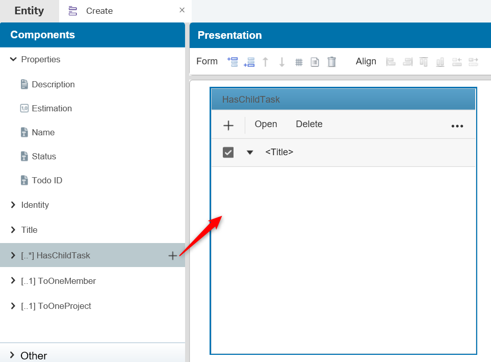
And we can keep the description for this type of relation pretty short as it behaves almost the same as the ‘toMany’ relationship component with a small difference in the selectable actions.
- On a ‘toMany’ component you can select the actions: open, clear, delete, create and browse
- On a ‘hasChild’ component you can select the actions: open, delete and create
The ‘Clear’ and ‘Browse’ actions are missing…but why?…Well, the ‘hasChild’ relation can be seen as a kind of ‘repeating’ property, but AppWorks made it an 2.0 version out of it be and made also all the building block functionality available because it’s a relation. In that case a create (to add a new value) and delete (to remove the value) for managing the ‘repeating’ items should be enough, but because it’s a full entity relation we also have the ‘open’ action available. ‘Browse’ is not needed as there is nothing to select from and ‘Clear’ could be possible, but you can select all the created items and ‘Delete’ them!
Should be nice that there was an option to ‘Select all’ items!
Where can all those forms be used?
The ‘Create’ and ‘Default’ form are used standalone when you create or view an entity. Most of the time you’ll start with these so you can start to show something to your stakeholders.
A crafted form can also be re-used within a form. For quickly building and showing things we most of the time re-use the ‘Create’ form in the ‘Default’ form.
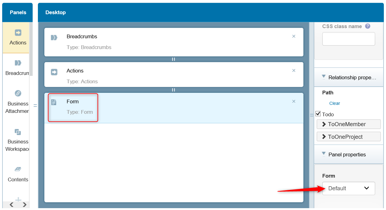
- Layouts are you next step for showing forms. A ‘Default’ form can be placed in a new layout (together with other panels) and the layout can be ‘marked’ to be used in the preview for the entity!
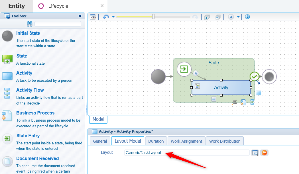
- The tasks list building block will be available once you start to play with lifecycles. It’s a related entity with its own building block structure where you can also create a form with all the task information. These forms (surrounded with a layout building block) can then be re-used when you start an activity!
This brings me the ‘DONE’ for this post where we learned a lot more about form craftsmanship. Great stuff to play with, but always think one step forward as a lot of information can be re-used in containers. Even the form itself can be re-used, so the ‘abstraction’ of forms to a higher level is possible also! The best tip is to always involve a UI expert in the creation of good UI sketches we can build in AppWorks. Have a great day as there is nothing more to say…Over and out for now. CU in the next post.
Don’t forget to subscribe to get updates on the activities happening on this site.
